


A map, a graph, a timeline: When we think about data in news stories, our minds naturally jump to these kinds of visual elements. But the core of data journalism is less about specific charts, and more about scale—it gives us a way to understand big stories and lots of numbers, by analyzing and aggregating them until we can see the shape of the trends within.
2022 was my first full calendar year as the editor of Chalkbeat’s data team, and what a year for data it was. Here’s a baker’s dozen of the stories that we feel captured our best work, and help sum up a busy 12 months reporting on education data across America.
1. NYC parents, was your child exposed to COVID? Here’s what to do next
It’s easy to forget now, but at the start of 2022 there was still a lot of confusion around what the return to school meant for public health: Policies around masking, quarantine, and contact tracing were all changing rapidly. Our team worked with Chalkbeat editors and reporters in New York City to create an interactive flowchart to reduce some of that confusion, so that parents could walk step by step through the requirements if their child or a classmate tested positive.
2. What five graphics tell us about COVID vaccine disparity in Chicago schools
Once vaccines were approved for children, they became part of a layered public health strategy for school districts trying to get kids back into classrooms. But like so much about COVID, vaccine distribution also revealed persistent inequality. In Chicago, data analysis from the district’s vaccination dashboard showed an organization struggling to keep kids safe, especially in historically Black and Hispanic neighborhoods on the South Side of the city.
3. Technology, Skyline rollout dominate Chicago Public Schools’ federal relief vendor spending
With the pandemic came federal money, through the Elementary and Secondary School Emergency Relief Funds, also known as ESSER I, II, and III. Flush with cash, school districts across the country channeled money into renovation, hiring, and equipment.
On this story, we looked at the data from Chicago Public Schools’ spending, to see who was making the most from ESSER purchases. Unsurprisingly, the tree map at the top shows how more than half of all spending went to only 10 mega-vendors out of almost 1,000 companies in the dataset.
4. How the COVID-19 pandemic is changing school data
Pandemics are natural data stories, but they are also big data events for governments and school administrations, and many states responded accordingly. Data reporters Kae Petrin and Kaitlyn Radde collaborated on this story to explore how COVID had exposed weaknesses in school data infrastructure, and the improvements they were making in response.
5. Nonbinary students aren’t reflected in federal civil rights data. That might change.
In a similar vein, this story from Kae Petrin looked into a proposed change from the federal Office of Civil Rights that would expand the gender categories used in state-reported data on harassment, absenteeism, and sexual assault. More than just a demographic marker, these kinds of changes — highlighted in a map from Cam Rodriguez — also show the seams of our patchwork educational system, and where they sometimes strain to keep up with social change.
6. In New Jersey, thousands of Black and Hispanic students are shut out of AP classes
One of the advantages of working on data at Chalkbeat is our local coverage, and the ability to work with bureaus that are deeply sourced in their communities. This story by Patrick Wall is a perfect example, as it digs into New Jersey’s AP class attendance gap, and its disproportionate effect on students of color, including maps and graphs from Cam Rodriguez that put the disparity into sharp contrast.
7. How the age-appropriate debate is altering curriculum in Tennessee and nationwide
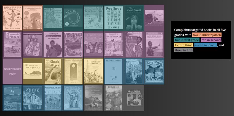
This year saw the political debate around critical race theory — the academic framework that examines how policies and the law perpetuate systemic racism and that is not commonly taught in primary or secondary schools — turned into an ongoing controversy around reading material in libraries and classrooms. For this enterprise story, our team added context for objections that parents had raised against the curriculum used by Williamson County, which included accusations of racism against Ruby Bridges’ autobiography and an assertion that a book on seahorses normalizes male pregnancy. We also wrote up some of our notes on the development of the visualization.
8. Nation’s report card: Massive drop in math scores, slide in reading linked to COVID disruption
After a year of delay from its normal schedule, the National Assessment of Educational Progress (NAEP) released test results that showed just how severely students were affected by learning loss during the pandemic. Our team worked with all of Chalkbeat’s bureaus to analyze these scores around the country, including demographic breakdowns. On the national level we also added comparisons to the impact of remote learning by state.
9. Online enrollment grows in Colorado but some say more accountability is needed
Analysis of NAEP scores showed that students didn’t clearly lose or gain in online schools, but that those schools’ growth hasn’t always been transparent. This report by Colorado reporter Yesenia Robles and data team member Kae Petrin dove deep into concerns around graduation rates and academic achievement at virtual schools, as well as wide gaps in the state’s data on their effectiveness.
10. As pandemic aid runs out, America is set to return to a broken school funding system
Pandemic relief funds were a windfall for many districts, especially after years of tight budgets at high-poverty schools. But with ESSER money due to expire soon, questions remain about how to make those changes sustainable and address historical underfunding. Our team worked on several ways to visualize this problem, including a spike map that juxtaposes population against per-student funding.
11. Ahead of school closures, 5 takeaways about the number of schools and students in Denver
Nationwide, shrinking school enrollment has led districts to make hard choices about keeping schools open, especially as smaller schools are more expensive and offer fewer options for each student. In Colorado, Chalkbeat has covered the debate over school closures, including this analysis-based story on how Denver school growth (both district and charter) has tracked against the student population.
12. Interest in running for Indianapolis school board drops to new low
Two sets of local elected officials became the center of intense (often negative) scrutiny this year: election supervisors and school boards. In Indiana, Cam Rodriguez worked with Chalkbeat and WFYI reporters to put together this comparison of election cohorts over time, showing how candidate interest in school board openings has dropped, even as the cost of running has increased.
13. Michigan students who are homeless more likely to be disciplined
Based on a University of Michigan study, this story features a map that isn’t just an illustration of population density (a common mistake) but gives readers a way to explore the relationship between school discipline and student homelessness.
Read more on our team blog
One of the most important lessons of my career has been the importance of working in public, such that readers can see and understand the choices we make in the course of reporting a story. Since data can be so large and complicated, it’s important to bring people into our process. To that end, we’ve been working on a team blog where we document our decisions and hopefully add to the conversation in the news nerd community. If you’re curious about how we scrape school dashboards, generate machine-readable document scans, or collaborate with our local newsrooms on graphics, feel free to check it out!